ANZ
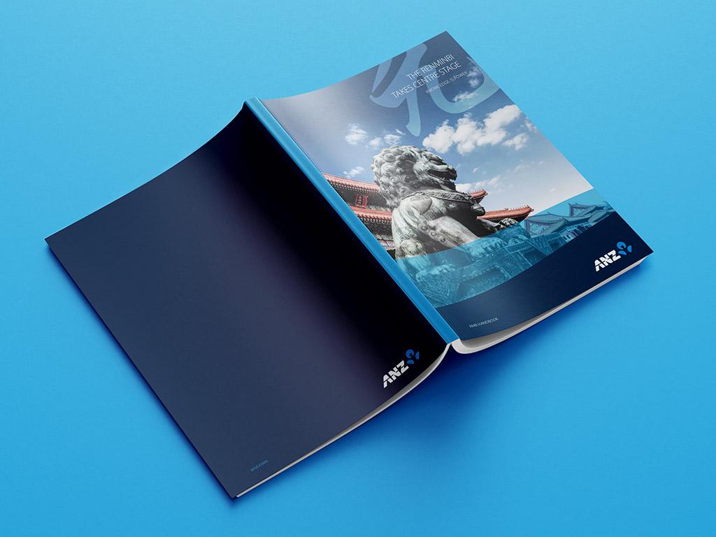
Renminbi Takes Centre Stage
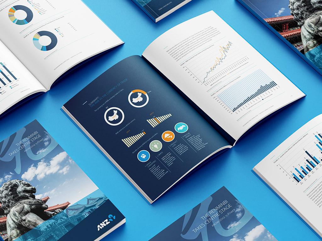
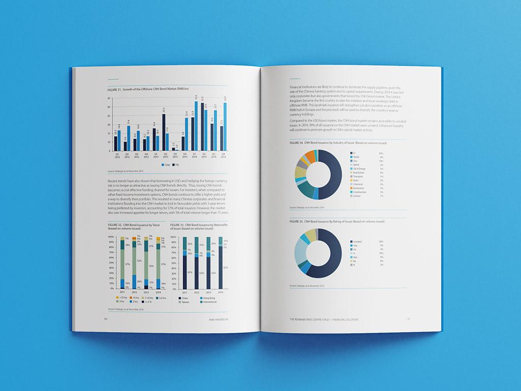
ANZ needed its annual report to do more than account for the year — it needed a point of view. We built the edition around a single editorial thread, the rise of the renminbi, and let typography and data visualisation carry the argument across the document.
The brief
An annual report that reads as obligation, not argument — dense with numbers but silent on what they mean. ANZ wanted a document with a thesis.
The move
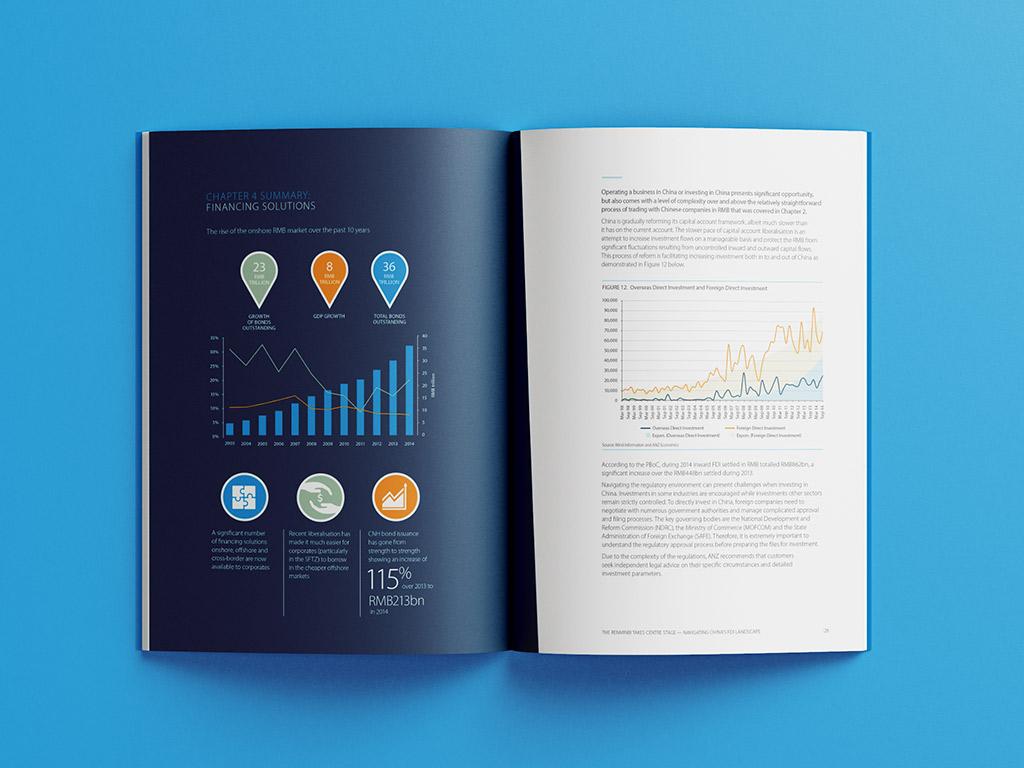
We anchored the whole edition to one story — the rise of the renminbi — and let a tight typographic system and purpose-built data visualisation carry it page to page.
The result
A report that argues instead of accounts. One editorial thread, held from cover to close, that gives the year a point of view.