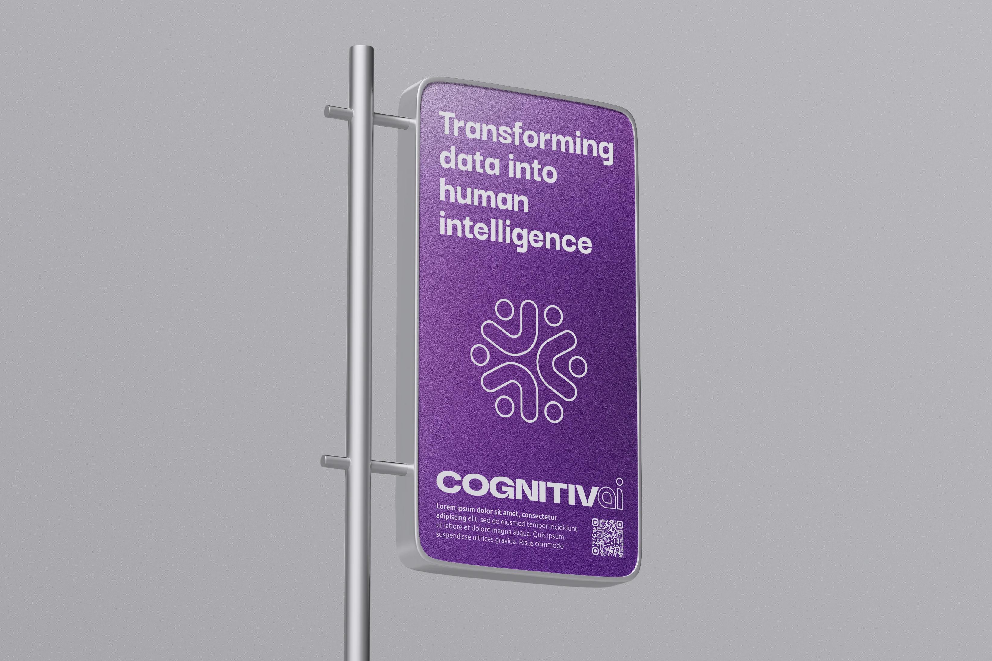
A purple street-pole sign reading 'Transforming data into human intelligence' above the Cognitiv AI mark.
Cognitiv AI

Brand Identity & Guidelines

Cognitiv AI needed an identity that read as credible and human, not another generic tech brand. We developed the full system — logo, type, colour, motion principles — and documented it in a brandbook the team could actually run with.

The brief

Every AI startup reaches for the same gradient-and-glow shorthand. Cognitiv wanted to read as credible and human — a company, not a category.
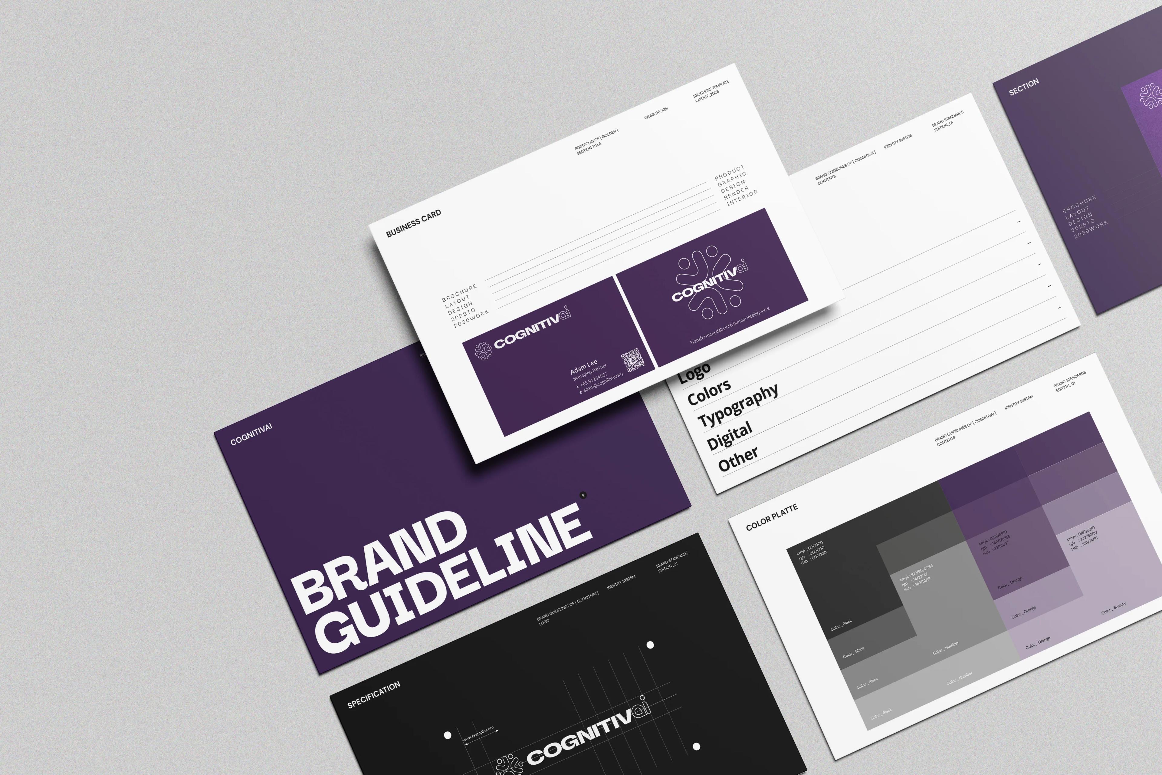
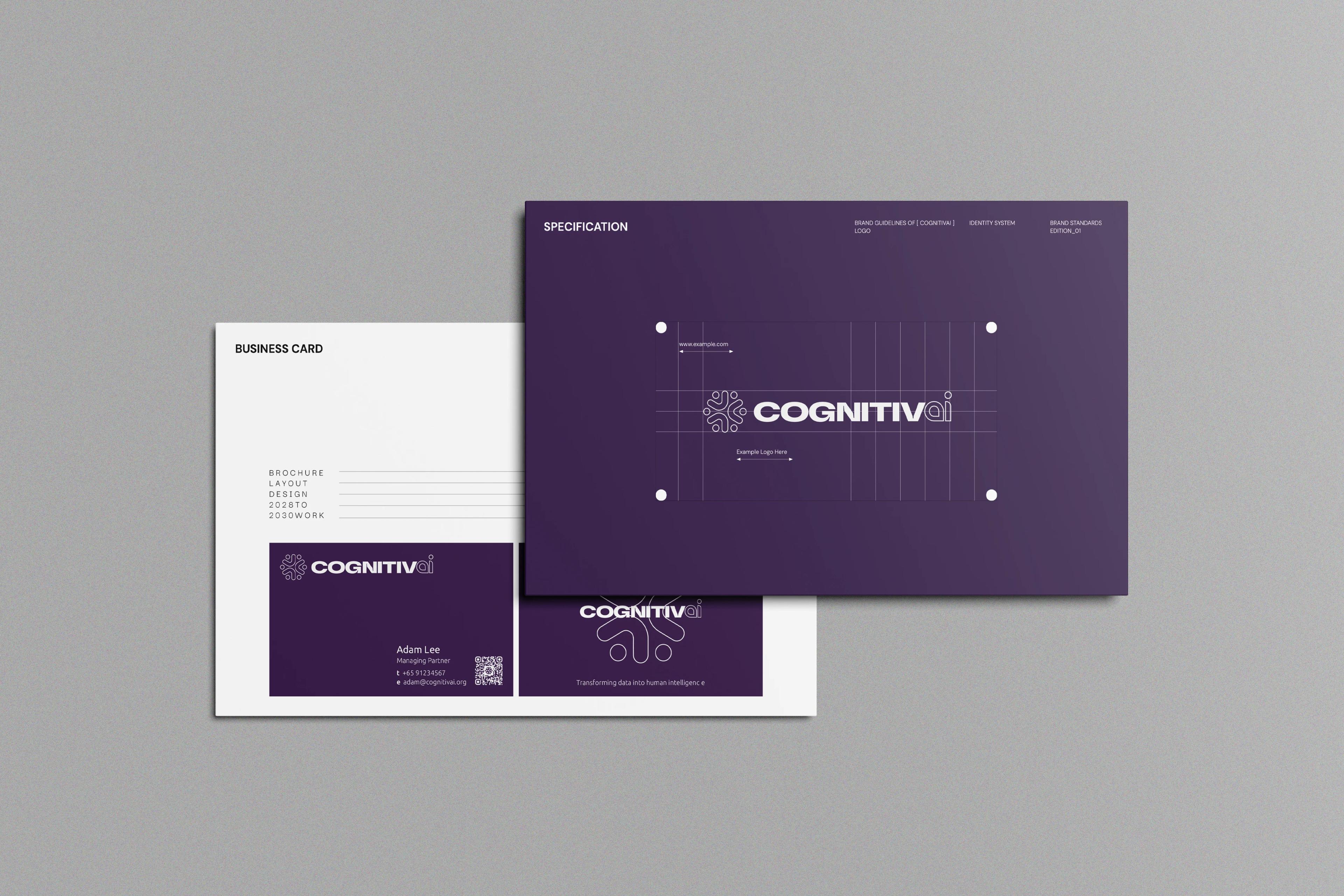
Brand guideline pages spread on grey: cover, contents, colour palette, logo specification and business-card layouts.
A purple logo-specification sheet showing the wordmark on its construction grid, beside business cards.
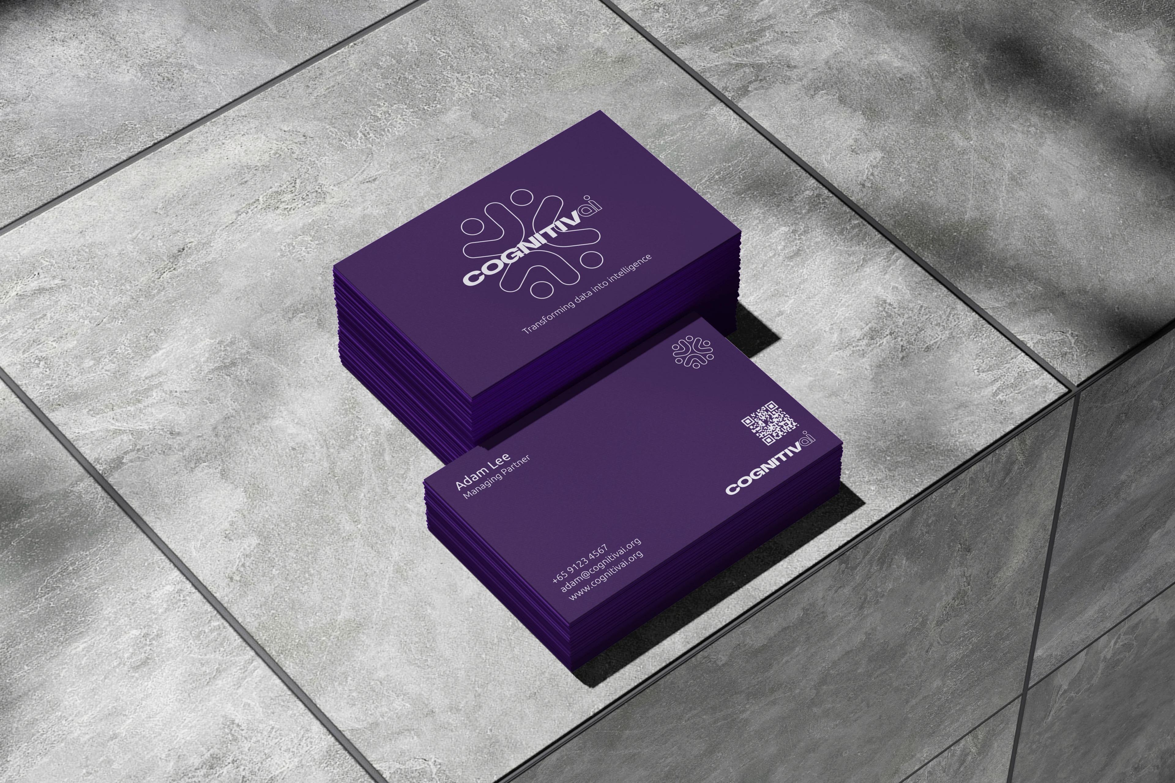
A stack of deep-purple business cards on a marble ledge, the top card showing the linked-figures monogram.
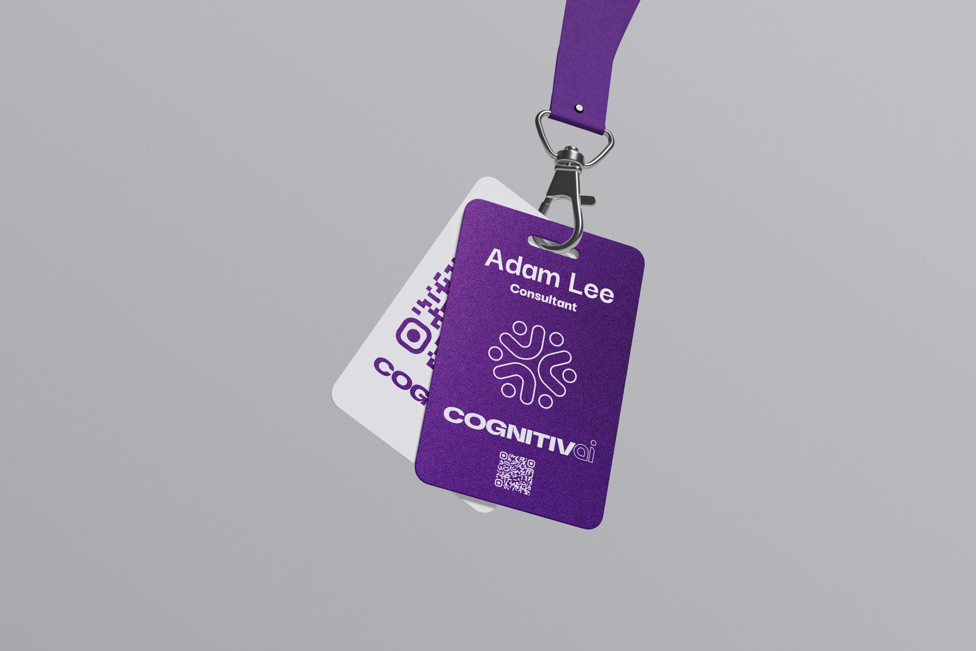
A purple lanyard badge for a named consultant, carrying the monogram, wordmark and a QR code.
The move

We built the full system from first principles — logo, type, colour, and motion — each choice earning its place against a plain test: does this feel human or does it feel generated?
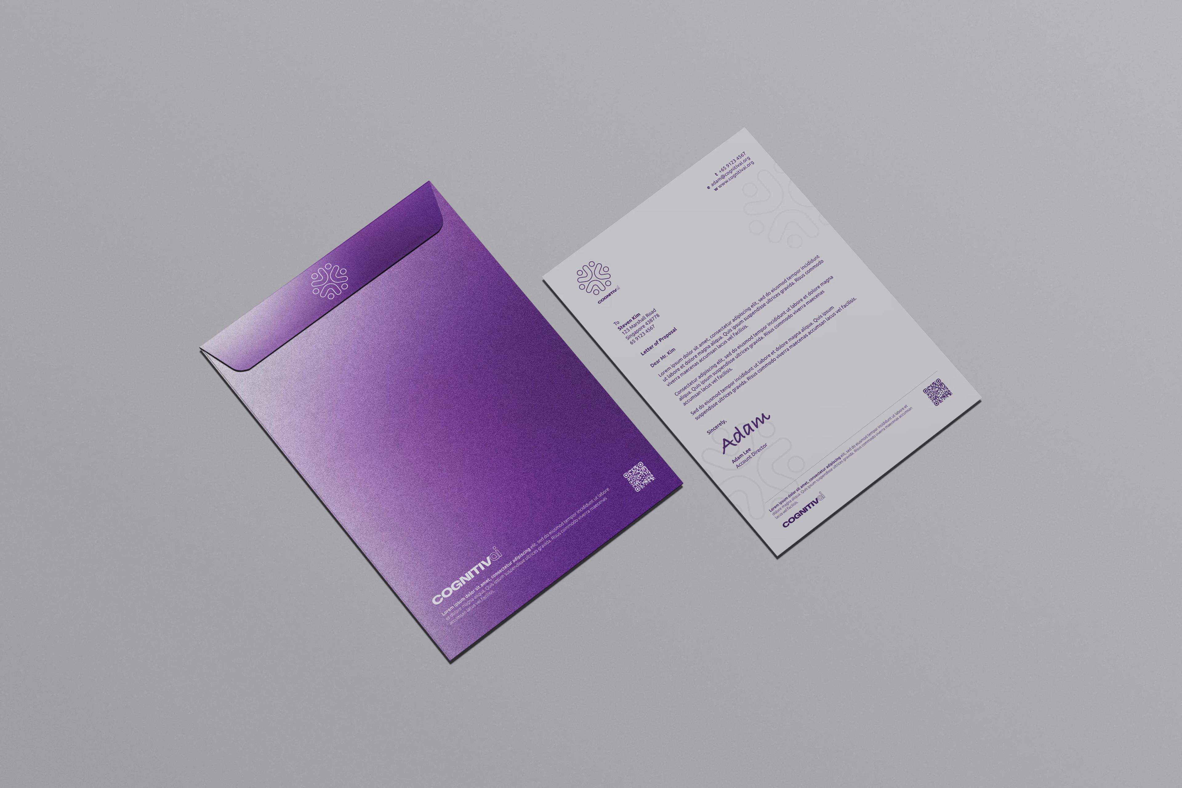
A purple envelope beside a letterhead printed with a faint pattern of the brand monogram.
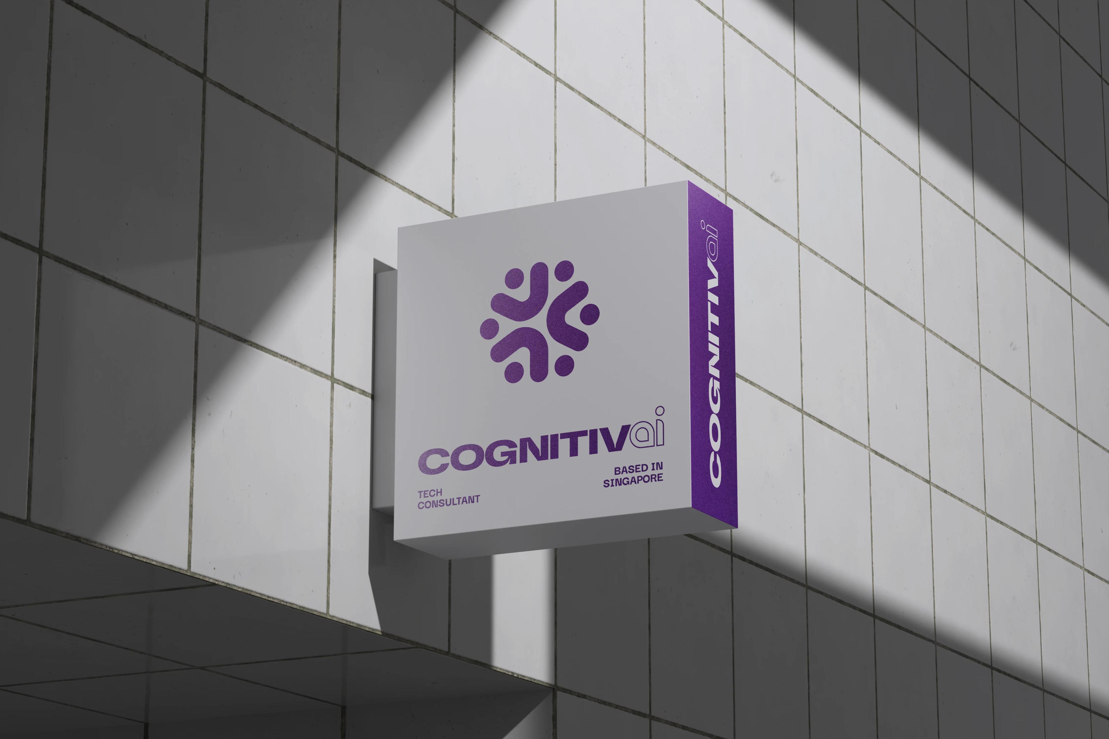
A projecting box sign on a tiled facade reading Cognitiv AI, the purple return edge catching light.
The result

An identity documented in a brandbook the team can actually run with — enough rules to stay coherent, enough room to keep moving.
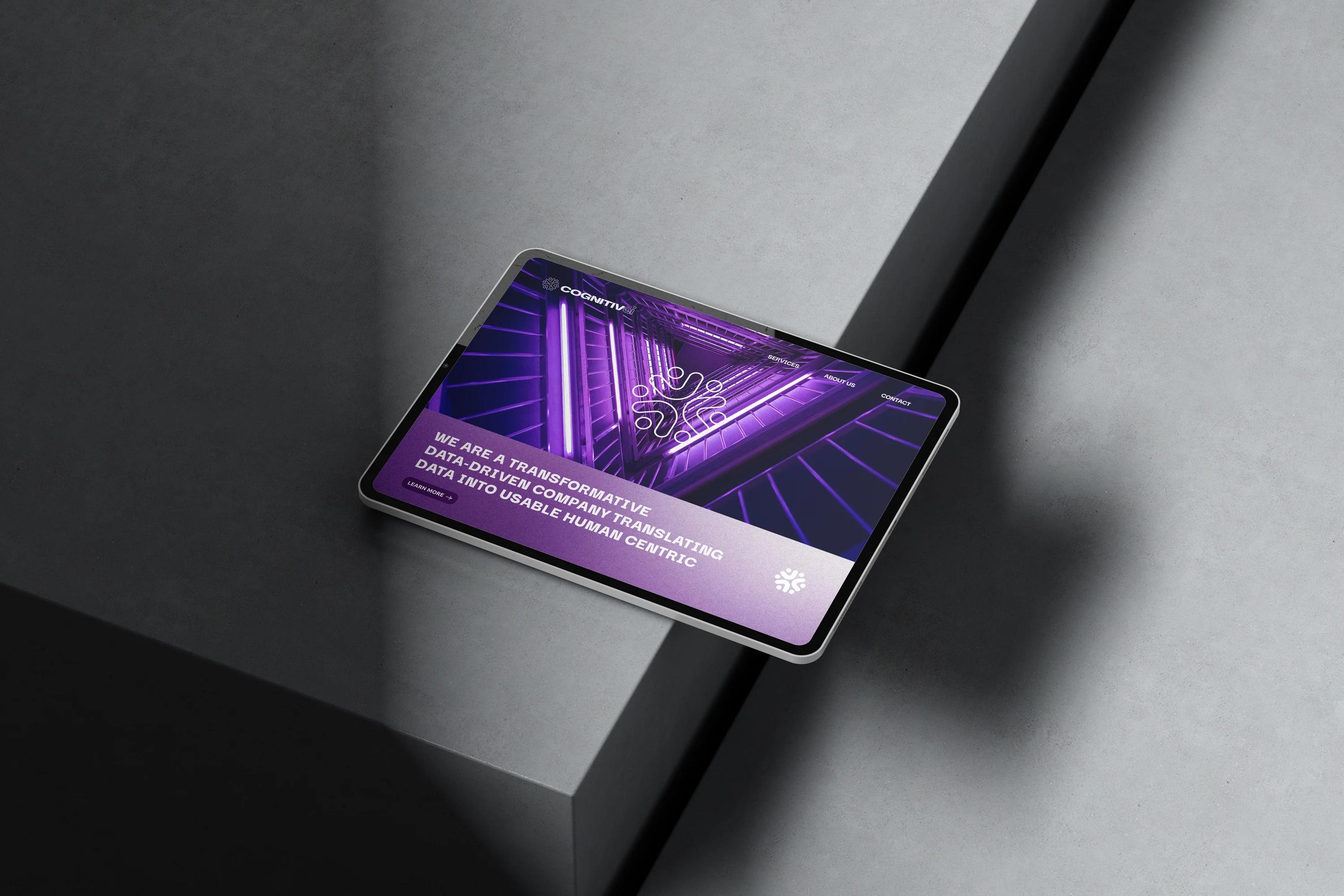

A tablet on a concrete block showing the website homepage: a violet corridor of light behind the positioning statement.
[Next project]

Terre d'Hermès Campaign

Hermès →